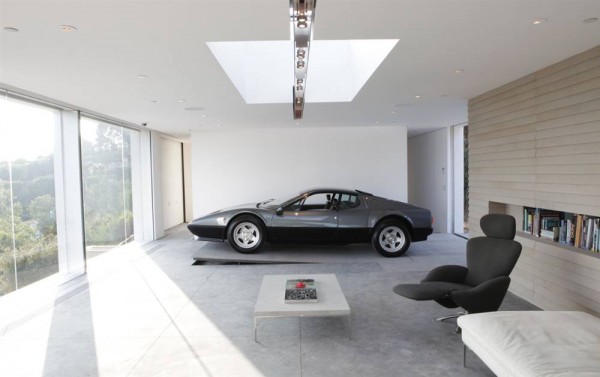
This house’s interior is aligned with my personal goals: no clutter, minimalistic, baring only the essentials. All-white (and by white, it needs to be white… not an off-white or cream) walls with 90° corners. I’m not into the whole rounded-corners-with-differently-colored-rooms look. I think I’d also prefer the walls to be non-textured. The living space is also modestly sized; I rather have a house that’s on the small size than one with too much space. Generously partitioned open areas are a must. Bisecting a floorplan into an unnecessary number of rooms should be an architectural crime. Most importantly, there is no TV – just a nice shelf with books. That is how to live proper, in my opinion. The Miami Vice-era Ferrari should go, however, not into it. From a purely aesthetics standpoint, I can agree that the car’s color complements the neutral tones in the picture… it’s just too bad that the car itself is so ugly. A 60’s Berlinetta would have been far more favored.


This reminds me of ferris bueller.