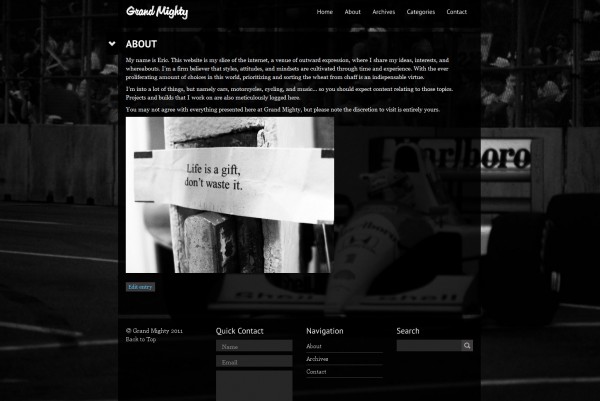
If you’ve been paying attention to the site over the past few weeks, you may have noticed several different layout changes (one of which was prematurely declared here). It has been a rather frenetic process trying to obtain the right look. Although it became tedious and prolonged, I am finally giving this one my seal of approval.
I’ve still kept to my single-column, content focused, and dark themed roots. This layout is noticeably more “fancy” than past, minimalism emphasized iterations. Let me know what you think, if you so care.

